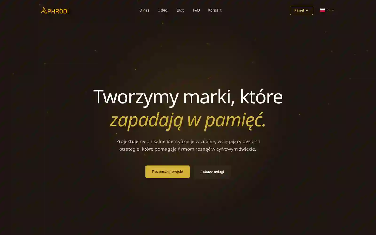
aphrodi.pl
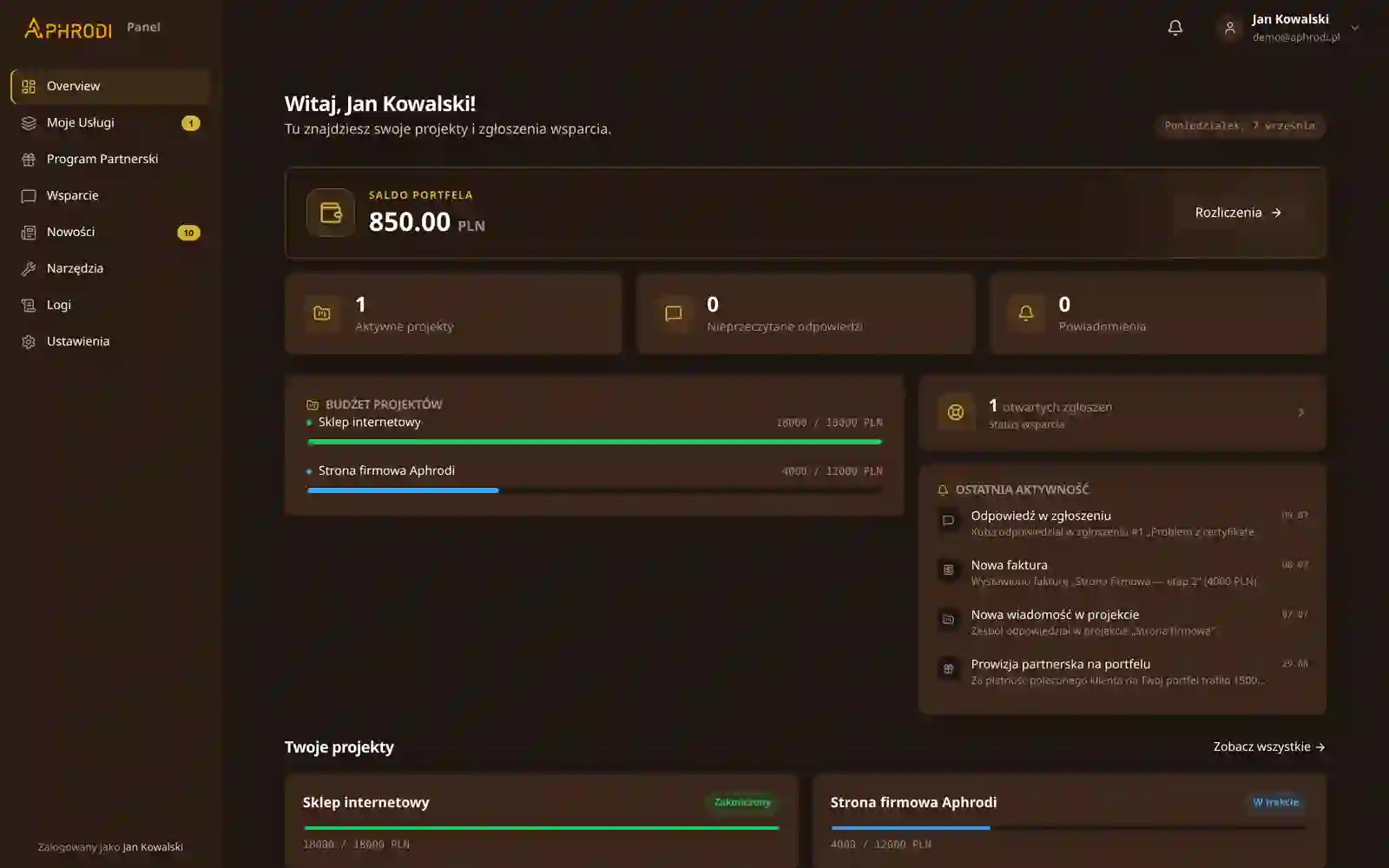
Aphrodi came with its own detailed design. We built it pixel-perfect, together with a CMS for the portfolio and services.
Identity and screen design come from Aphrodi, our partner branding agency, and we make the wireframes and the clickable prototype together with it. Then we carry the design into code as a design system and build your app on it.
You buy UI/UX design from us together with the build, as a partner project with Aphrodi. Both agencies make the wireframes and the clickable prototype together, and every stage ends with something you get.

Our partner branding agency
The logo, palette, typefaces and graphic style, when the brand has none yet.
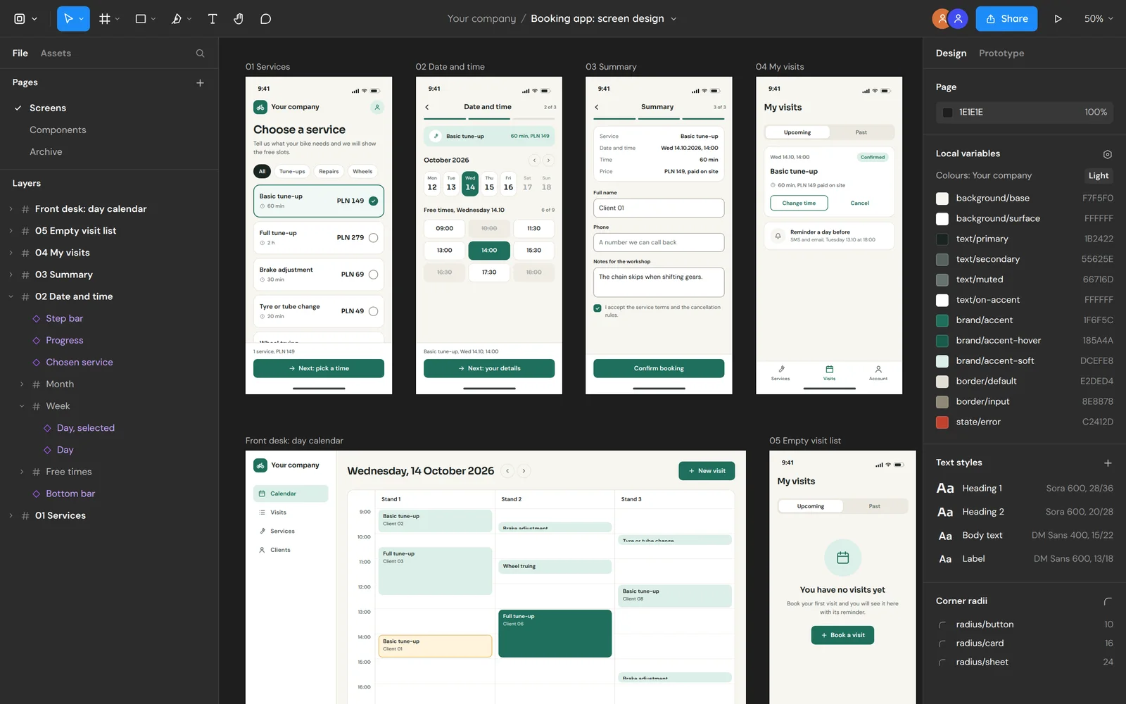
The screen layouts and a clickable prototype that shows what each button opens. Both agencies make them together.
The visual design of the app's screens, in the brand's colours.
Social media graphics and banners in the same identity, ready for launch day.
The decisions at every stage
You describe who uses the app and what they need to do in it.
You approve the screens before any code is written. A later change of scope needs the consent of both sides and may change the fee and the deadline (cl. 3.3 of our terms).
You check each stage of the app on a test version.
You hand over the texts, photos and access to the domain and accounts we connect to the app.

Design system and build
From that we quote the project and write an order with the scope, dates and payment stages.
The screen layouts and a clickable prototype that shows what each button opens. Both agencies make them together.
We write the design's colours, typefaces and radii down as tokens and build the interface components from them.
We build the app from those components and hand it over in stages for acceptance on a test version.
One screen of a booking app from sketch to code. We make the sketch and the wireframe together with Aphrodi, Aphrodi runs the visual design, and we run the build.
The layout in grey: what is on the screen and in what order, before any brand colour.
You get: The screen layouts
The wireframe shows what each button opens: here a tap on "Book a visit" slides up the form.
You get: The wireframes
The same layout in the brand's colours and typefaces. You approve this stage before any code is written.
You get: An approved design
The screen in code: backgrounds, colours and radii take their values from named tokens.
You get: Tokens and components in the repository
Real screenshots of projects where the look came from Aphrodi and the code from us.
Aphrodi came with its own detailed design. We built it pixel-perfect, together with a CMS for the portfolio and services.
The same layout as our client panel, in Aphrodi's colours and typefaces. A screenshot from a demo account.
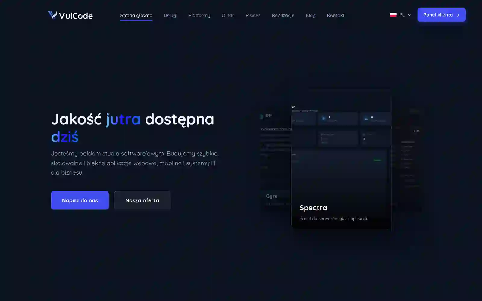
The site you are reading: the visual design was made with Aphrodi, and the React app with two language versions is ours.
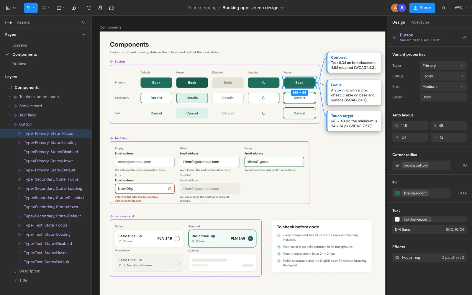
Colours, spacing and roundness have names in the design, and every button, field and card uses those names. Change the brand colour or the roundness and watch the whole set change at once.
Contrast of the button text: 5.9 : 1 readable for everyone
A design from Aphrodi or from your own designer goes through these checks before we start building it.
Empty view, loading, error and no permission each have a screen in the design rather than being bolted on at the end.
Text has at least 4.5:1 contrast on its background, per criterion 1.4.3 of WCAG 2.2. We compute it from the token values, not by eye.
Focus is visible on every element you can reach with the keyboard, and touch targets are at least 24 by 24 pixels, per criteria 2.4.7 and 2.5.8 of WCAG 2.2.
Long names, Polish characters and the English copy fit without breaking the layout.
Answers about the split of work with Aphrodi, the design files and the quote.
Aphrodi, and the pages about what we build on an approved design.
Tell us who will use the app and what they should do in it. We will reply within an hour with questions and a quote.